 NEW: BrowserGrow.com is now available!
AI agents to grow your business & do your marketing on autopilot in your browser

 NEW: BrowserGrow.com is now available!
AI agents to grow your business & do your marketing on autopilot in your browser


Interface design used to offer two choices: hire an expensive illustrator to build a proprietary brand language, or scavenge for stock assets that turned your product into a visual Frankenstein. Lean teams and startups faced a tough question: can off-the-shelf libraries actually support a coherent brand system, or are they destined to look like generic placeholders?
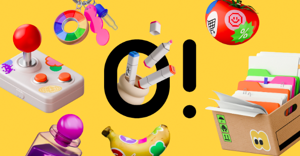
Ouch by Icons8 bridges that gap. It isn't just a repository of images; it is a library of consistent illustration styles built to cover entire user experience flows. From 404 pages to complex onboarding sequences, the platform provides enough depth within single styles to mimic the output of an in-house design team.
Stock illustrations usually fail in production because of continuity errors. You find the perfect "success state" image in a flat style. But when you need a corresponding "error state," the only available options are isometric or 3D. That mismatch breaks immersion and signals to the user that the product is a patchwork of disparate parts.
Ouch fixes this by organizing its 28,000+ business and 23,000+ technology illustrations into specific "Styles." Over 101 styles exist, ranging from 3D renders to minimal monochrome lines. Commit to a style-say, "Business 3D"-and you will likely find every asset needed for a standard SaaS application within that single visual language.
Real-world production environments test these claims best. Let's look at two distinct workflows: product development and content marketing.
Picture a small development team building a fintech dashboard. They have a design system for typography and buttons but lack visual assets for empty states and onboarding. Hiring a freelancer for 20 custom spot illustrations would delay their launch by weeks.
Using Ouch, the lead designer filters the library by "Finance" and selects a vector style that matches their clean, flat aesthetic. Down comes a "wallet," "credit card," and "analytics chart" in SVG format. Since the assets are vector-based, the designer opens them in Figma or Illustrator and swaps the default blue accent color for the fintech’s specific brand green.
Crucially, they also need niche states: a "card rejected" screen and a "server maintenance" notification. Because the chosen style covers the full UX flow, they find these specific metaphors without switching to a different artist. The result is a set of assets sharing the same stroke width, corner rounding, and perspective. It looks like custom work.
Take a social media manager tasked with creating daily content for an agency’s Instagram and LinkedIn. The brand identity is playful and modern. Relying on standard stock photos feels stale, but creating custom 3D art daily is impossible.
The manager heads to the 3D section of Ouch, housing 44 distinct 3D styles. They select a style featuring soft lighting and pastel tones. For a post about "remote work," they search for objects rather than full scenes-finding a 3D laptop, a coffee cup, and a comfortable chair.
They download these as high-res PNGs (free with attribution, or attribution-free on paid plans) and compose them into a carousel. Later, a blog post needs an animation. They toggle the format filter to Lottie or GIF and find an animated version of the same character style typing at a desk. The visual thread remains unbroken across media formats.


Assets are rarely 100% perfect right out of the box. Here is what the refinement process looks like using Ouch’s tools.
A designer is working on a landing page for an education platform. They have the Ouch website open alongside their design tool. They find a vector illustration of a student sitting at a desk. It works, but the student holds a pen. The client specifically wants them typing on a tablet.
Don't scrap the image. Click "Edit in Mega Creator" to open the asset in Icons8’s integrated editor. Select the arm holding the pen and delete it. Search the component library for "arm holding tablet" within the same style family. Drag the new arm into place, scale it to fit the shoulder joint, and recolor the sleeve to match the shirt.
Once the composition makes sense, export the modified SVG. Finally, drag the file into the Pichon desktop app-a tool that keeps the library accessible offline-to ensure quick access to this modified asset for future screens. Ten minutes of editing saves hours of drawing time.
Stock assets have evolved significantly from the days of generic clip art that plagued early web design. Here is how Ouch stacks up against current competitors.
Ouch vs. Freepik
Freepik offers massive volume, often more than Ouch. But it aggregates thousands of different contributors. Finding 20 images that look exactly the same on Freepik is difficult because they come from different artists with varying techniques. Ouch controls the production of its styles, ensuring higher consistency across the set.
Ouch vs. Humaaans/Blush
Blush (and libraries like Humaaans) excels at character composition. If you only need people, they are fantastic. But Ouch creates a broader range of "objects" and "elements." If your interface needs a server rack, a microchip, or a specific medical instrument, Ouch is more likely to have these inanimate objects in the same style as your characters.
Ouch vs. Undraw
Undraw is the open-source standard for tech illustrations. It is free and clean. But it suffers from ubiquity. Because so many startups use Undraw, using it can make a new product look like a template. Ouch offers more "personality" and stylistic variety (surrealism, collage, retro) that helps brands differentiate.
Ouch is robust, but it isn't a magic bullet for every scenario.
Complex Metaphors: If your brand relies on highly abstract or specific visual metaphors (e.g., "a cybernetic octopus fighting a cloud server"), you will hit a wall. Stock libraries cover common use cases; they cannot predict wildly creative marketing campaigns.
Exclusive IP: You cannot trademark a logo or mascot derived from these assets. Building a brand where the character itself is the product (like the Duolingo owl) requires owning the IP outright.
3D Customization: While Ouch provides FBX files for 3D models, editing 3D geometry is significantly harder than tweaking 2D vectors. Without 3D modeling skills, you are mostly stuck with the pre-rendered angles provided.


Follow these practices to get the most out of the library and avoid the "stock look":
Kill the default palette: Even if the default colors look nice, change them. Mapping vector paths to your brand’s specific hex codes is the single most effective way to make stock assets look proprietary.
Mix formats carefully: Ouch offers Lottie (JSON), Rive, and After Effects files. Use lightweight Lottie animations for mobile app onboarding screens. It adds polish without the file size bloat of video.
Search by Object, not Scene: Don't just search for "meeting." Search for "table," "chair," "whiteboard," and "person." Composing your own scene using individual vector parts usually yields a better composition than pre-made scenes.
Leverage the Desktop App: Heavy users should grab the Pichon app. It lets you drag and drop assets directly into tools like Photoshop or Figma without constantly downloading and unzipping files.
Can an off-the-shelf library support a coherent brand system? In the case of Ouch, yes-provided you commit to a specific style and use the customization features. It solves the fragmentation issue plaguing most stock sites by treating illustrations as design systems rather than isolated pictures. For teams that need to move fast without sacrificing visual continuity, it offers a viable middle ground between the generic and the bespoke.