LIMITED SPOTS
All plans are 30% OFF for the first month! with the code WELCOME303
LIMITED SPOTS
All plans are 30% OFF for the first month! with the code WELCOME303

LIMITED SPOTS
All plans are 30% OFF for the first month! with the code WELCOME303
Interactive dashboards help leaders move from reading reports to acting on them. This article explains how clear design turns raw metrics into usable insight.
It covers choosing chart types that fit the question, arranging elements so key numbers are seen first, and using color and thresholds to signal performance. You will learn where filters and drill-downs add depth, and how to keep them simple.
The guide also looks at implementation basics, from picking tools and connecting data sources to keeping information consistent. Finally, it highlights ways to prepare dashboards for new needs, including predictive analytics and stronger governance.
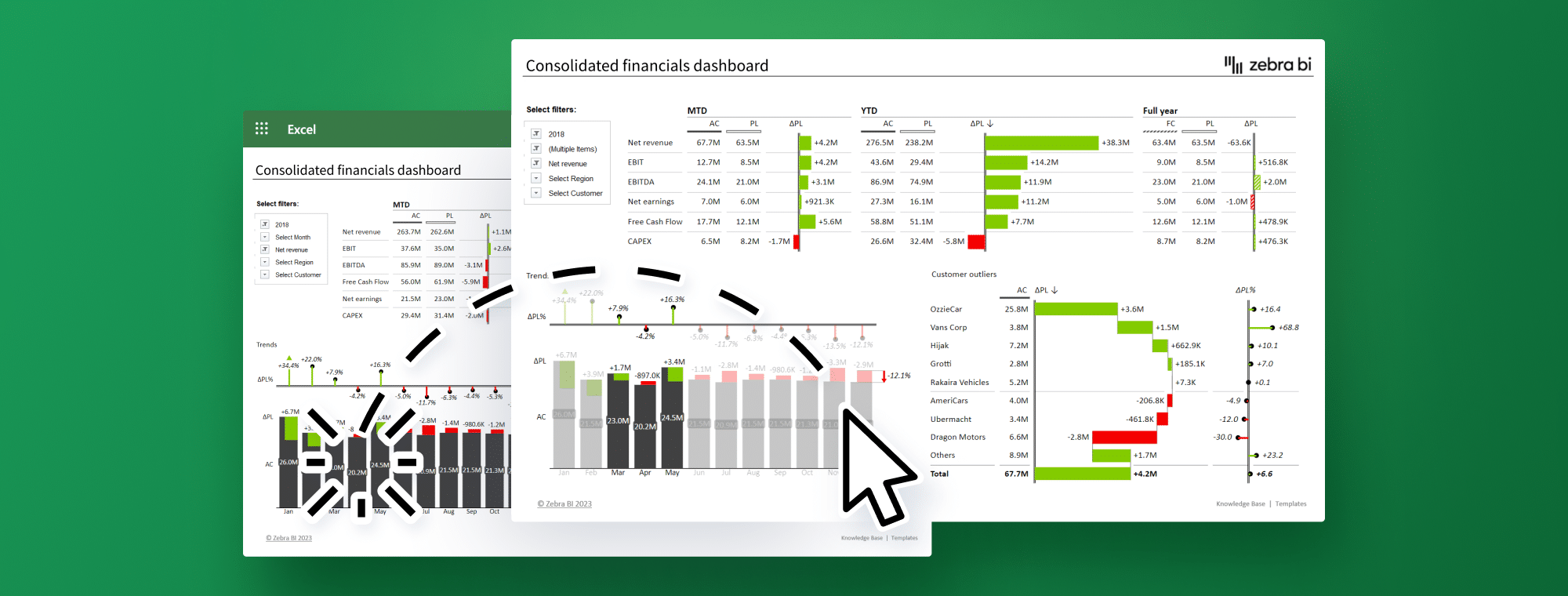
A well-designed executive dashboard does more than display numbers on a screen. Design quality determines whether it succeeds or fails. Bad design makes data harder to understand, whatever the quality of the underlying information.
The right chart type turns raw data into applicable information. Bar charts excel at category comparisons. Line charts best show time-based trends. Pie charts effectively show proportions, yet become messy with excess segments.
Questions need specific data visuals:
Comparison questions: Bar charts, column charts
Trend questions: Line charts, area charts
Relationship questions: Scatter plots
Distribution questions: Histograms
Note that your visual should match the insight you want to share. Avoid using pie charts to show trends or tables when visuals communicate the information more effectively. The best data visuals tell your story instantly, with minimal cognitive effort.
People naturally scan from the top left corner first. Your most important metrics belong there. An expert points out, "When dashboards lack consistency, users can become confused and overwhelmed, reducing the dashboard's effectiveness".
Good visual hierarchy guides users through data logically:
Start with clear sections and consistent spacing (15-20 pixels) between groups. Make size work for you; bigger elements naturally draw eyes to key metrics. Keep enough whitespace to separate information and avoid overwhelming users.
Related metrics should stay together. This helps executives compare and learn without searching the entire dashboard. Financial metrics belong in one section and marketing metrics in another to create better information flow.
Colors serve two main purposes: they separate categories and highlight what matters. One expert says, "The purpose of color in its coverage and dashboards is to guide an end user's attention".
Visual context comes from setting the right thresholds. Red might appear at 80% capacity or below 70% of the target. These visual signals show performance instantly without calculations.
Colors should never stand alone. Labels or symbols should accompany colors to keep dashboards available for people with color vision issues.
Traffic light colors work best: green means success, red shows alerts, and yellow indicates warnings. This matches the universal system we already know.
Static dashboards limit users to preset questions. Adding interactive elements turns them into discovery tools. Zebra BI data visuals let executives explore data their way.
Single-click filtering creates easy data exploration across all dashboard visualizations. Executives can start with big picture views and dig into specifics without switching screens.
Interactive widgets filter data across all dashboard reports dynamically. These filters stay in place between sessions, showing the executive's preferred view automatically when they return.
Executives can find data connections without waiting for new analyst reports. This self-service approach speeds up decisions and reveals hidden insights.
A successful executive dashboard needs careful planning and the right technical approach. Many dashboards fail because organizations pick the wrong tools, or users don't adopt them.
The dashboard software market offers many options, from free tools to enterprise-grade solutions.
Here's what you should think about when choosing:
How well it connects with your existing systems
How flexible is it for different business needs
Whether it works well on mobile devices
A price that fits your budget
Popular tools such as Datapad, Tableau, Microsoft Power BI, and Qlik each offer unique capabilities. Datapad shines with quick setup and an accessible design, while Power BI excels at complex data modeling. You should review free trials before picking a platform. Hands-on testing reveals issues that specs alone can't show.
Effective dashboards need solid data integration. Most dashboards connect to multiple sources, such as CRMs, financial systems, marketing platforms, and operational databases. This technical foundation makes your dashboard reliable and easy to maintain.
Automated data collection eliminates manual errors and significantly saves time. Your needs determine the best integration method. ETL (Extract, Transform, Load) is well-suited to complex data tasks, while real-time API connections are better for instant updates.
Creating custom visuals with Zebra BI makes data clear and actionable. These specialized visuals help people quickly understand complex information. Interactive visuals help make smarter decisions.
Bad data hurts more than having no dashboard. Strong data governance keeps information accurate. Regular audits of data sources help verify information before it appears in reports.
A centralized "single source of truth" prevents departments from showing different metrics. So teams work with similar numbers, reducing disputes over data accuracy.
The best dashboard becomes useless without proper training. Teams should walk executives through features, focusing on navigation and data interpretation.
Dashboards that match each leader's goals drive better adoption. Email summaries that express key points directly to executives' inboxes help initially. This step-by-step approach builds comfort without overwhelming anyone.
Using dashboards instead of slides during meetings shows their real-life application. This practice proves their value and makes them essential tools for decision-making.
Tomorrow's dashboards will be quite different from what we see today. Businesses generate more data than ever, and success requires looking beyond current metrics to anticipate future trends.
Predictive analytics changes how executives use data by moving from hindsight to foresight. These tools use data mining, statistics, and machine learning to interpret historical patterns and forecast future outcomes.
Smart organizations now see digital dashboard technologies as strategic assets, not just utilities.
This approach offers clear benefits:
Spot emerging trends before they affect your organization
Forecast inventory needs and optimize pricing strategies
Detect unusual activities like fraudulent transactions or cyberattacks
Modern AI-powered dashboards do more than traditional visualizations. As one expert notes, they "simulate outcomes and suggest next best actions". These systems actively work with you to find the best path forward.
Fluid approaches that respond to market changes have replaced static strategic plans. Modern dashboards work like a GPS for your business and show multiple routes to help direct you through changing conditions.
Your dashboard stays relevant when you:
Check model accuracy often to avoid prediction errors
Make data processes efficient as datasets grow
Adjust visualizations based on changing business priorities
Better collaboration features help teams connect through integrated workspaces and break down organizational barriers. This teamwork guides better execution across departments.
Sensitive information on dashboards needs proper protection. Good data governance builds trust and helps people understand information better.
Create role-based access controls to determine who sees what. Regular audits and compliance checks help maintain data quality and build stakeholder confidence.
Data quality processes play a crucial role - they check and clean information to keep your Zebra BI data visuals reliable. Unreliable data makes insights questionable.
Data governance requires continuous attention and improvement. Start small with pilot projects and apply what you learn to bigger initiatives. This method brings fundamental changes to your organization gradually but effectively.
Well-built dashboards are equal parts design, data, and habit. Using the right visuals, clean labels, and steady scales makes trends easy to grasp quickly.
Thoughtful layout and restrained color keep attention on what matters, while filters and drill-downs let executives explore without extra reports. On the back end, reliable integration and a single source of truth prevent conflicting numbers. Training and regular review help teams adopt the view in real meetings.
As data volumes grow, adding predictive features and tight access controls keeps dashboards useful and safe over time. Small updates based on real usage keep the story clear as priorities shift.
 Send emails at scale