LIMITED SPOTS
All plans are 30% OFF for the first month! with the code WELCOME303
LIMITED SPOTS
All plans are 30% OFF for the first month! with the code WELCOME303

LIMITED SPOTS
All plans are 30% OFF for the first month! with the code WELCOME303

Most people don’t notice white space until it’s missing. Then suddenly, everything feels off – crowded, loud, and hard to follow.
That’s because white space isn’t empty. It has a job. When used well, it gives content room to breathe. It makes layouts easier to scan and understand. It helps guide attention without overwhelming the user.
We’ve worked with enough brands and teams to know that cluttered design doesn’t come from bad intentions. It usually comes from trying to fit too much in too fast. The thing is, less really can do more when you use white space on purpose. It’s one of the simplest ways to reduce cognitive load, which means people don’t have to work as hard to get your message.
Whether you’re designing a website, a landing page, or a mobile app, white space plays a key role in how people experience your content.
Let’s break this down.
Your main message should be the first thing people should notice when they land on your site. If it’s buried in a crowded layout, you’re making visitors work too hard, and most won’t bother. Clear communication starts with giving your core message space to shine.
That’s where white space comes in. It helps draw attention without force. It creates visual priority, giving the eye a clear starting point.
This tactic works because it respects how people actually browse. Most visitors skim. They scan for quick clues about what you offer and why it matters. When your message has enough space around it, it stands out naturally. There’s no confusion about what to read first or where to look.
Place your main message (usually your value proposition) high on the page, ideally in the header.
Keep the copy short and straightforward.
Use a large, readable font.
Strip away any distractions nearby. That means no walls of text, unnecessary images, or too many buttons.
Let the message breathe with plenty of padding around it.
To see how this is done, take a look at Bay Alarm Medical, a company that provides medical alert systems for seniors and caregivers.
On their homepage, the header boldly states, “America’s Most Trusted Medical Alert Systems.” It’s set in clean typography, surrounded by generous white space.
There’s no clutter around – just a relatable visual, a couple of clear CTAs, and the message. That’s it. The layout immediately tells visitors what the company does and builds trust from the start.
Source: bayalarmmedical.com
This focused approach cuts through the noise immediately. Visitors understand what the brand offers and why they should care within seconds. The white space ensures their core message hits home before attention wanders to other page elements.
When a page feels packed, people don’t stick around to figure it out. They leave. That’s because the brain needs clarity to process information quickly.
Websites that use white space effectively get nearly 50% more visual attention than those that don’t. More space doesn’t just look nicer but also helps people focus on what matters most.
This use of white space reduces friction. When important elements, like product benefits, features, pricing, or CTAs, have enough space around them, users can identify them faster. They don’t have to scan back and forth or guess what to click. The path becomes clearer, and that makes decision-making easier.
Outline the most important elements on each page. That might be a headline, a CTA, or a key product feature.
Then, build space around them. Use consistent padding and margins.
Let related content group naturally, but avoid packing everything too close.
Maintain visual rhythm with balanced spacing between sections, headings, and buttons.
Resist the urge to fill every corner. Sometimes, the best thing you can add is nothing.
A great example of this is Brain Ritual, a brand focused on science-backed supplements for people managing migraines.
Their website is clean and intentional. Every product card, line of copy, and visual is spaced just right. There’s no guesswork. Users immediately understand what they’re seeing and how to navigate it. Information feels organized, and the layout flows without visual noise. That clarity turns browsing into a calm, straightforward experience.
Achieving this level of clean, intentional layout is exactly why many companies choose to hire a UI designer who understands the balance between aesthetics and usability.
Source: brainritual.com
The result feels organized and professional rather than overwhelming. Visitors can focus on evaluating products and making buying decisions instead of figuring out how to navigate the site. This is also what Baumgartner Law firm does by drawing attention to their proven track record of saving millions for clients.

Explaining a complex process doesn’t have to feel like writing a manual. When done right, even the most technical steps can feel easy to understand. The key is structure, and white space plays a big part in that.
Without enough space, information blurs together. With the right spacing, each piece stands on its own, helping users absorb one step at a time. This gives users a mental break between points. Instead of overwhelming them with dense blocks of information, it breaks things down into digestible parts.
White space creates visual separation, which helps guide the eye and reduce cognitive overload. That’s especially important for businesses offering services that aren’t instantly familiar.
Break down your process into clear, logical steps.
Don’t try to say everything at once. Give each step its own area with enough padding.
Use short headings to label each stage.
Add simple visuals or icons to reinforce meaning.
Write concise copy that’s easy to skim.
Avoid squeezing steps too close together. Crowding can undo all your effort.
RE Cost Seg, a company that helps real estate owners with cost segregation, does this well.
Their website includes a section that outlines their process in three clean steps. Each step has its own space, with an intuitive icon, a short subheading, and plain-language text. Nothing feels cramped or confusing. Even if a visitor doesn’t know what cost segregation is, the layout makes the process feel manageable.
Source: recostseg.com
This smart use of white space transforms technical expertise into an approachable process. Visitors understand what to expect without getting lost in industry jargon or overwhelming details.
If your content is hard to read, it won’t get read. That might sound obvious, but it’s often overlooked. People don’t just need information. They need to understand it quickly.
The use of white space can improve comprehension by up to 20%. When content is broken up and spaced well, users stay engaged longer and absorb more of what they see.
This method respects how people process information. Most users don’t read word for word but simply scan. They’re looking for cues that guide them to the parts they care about. White space supports this by creating separation between ideas and giving the eyes room to move naturally down the page.
Structure your content in small, manageable chunks.
Use headings that actually say something.
Keep paragraphs short.
Use bullet points when listing features or steps.
Add visuals that support the message, not just fill space.
Don’t be afraid to let things breathe. Add ample spacing between every element (text blocks, images, buttons, etc.).
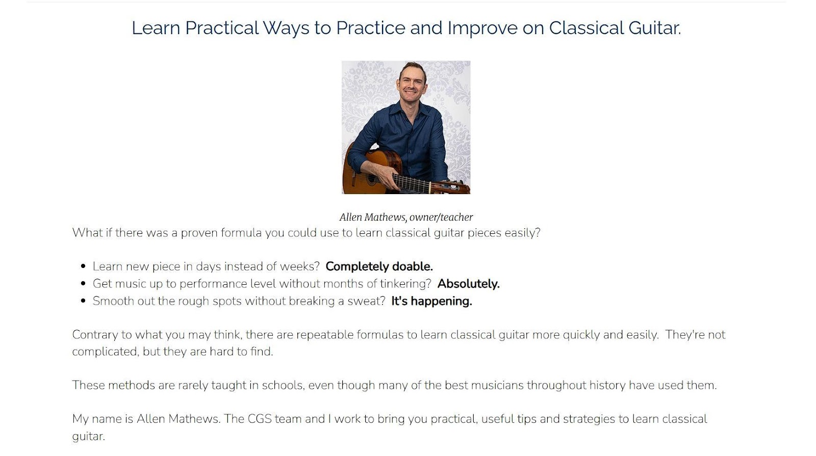
Classical Guitar Shed, a company offering online guitar courses, handles this with precision.
Their homepage includes a lot of useful detail but never feels overwhelming. They use clear section headings, concise paragraphs, bullet points, and visual aids, all spaced thoughtfully. Visitors can skim for highlights or read more deeply without losing track of where they are.
Source: classicalguitarshed.com
This way, information feels approachable. It’s easier to read, easier to understand, and easier to trust.
Design shapes how people feel about your brand. A site might work perfectly, but if it looks outdated or crowded, people will bounce.
Research shows that almost 60% of users prefer beautifully designed websites over functional but unattractive ones. A clean, well-spaced layout builds trust and credibility while being pleasant to the eye.
Using white space in this regard works because presentation affects perception. When your site feels polished, your product does, too. White space plays a big role in creating that polish. It adds a sense of order and intention. It makes pages feel curated rather than thrown together and helps users focus on the details that matter, whether that’s product quality, brand story, or the purchase path.
Focus on restraint. Choose a simple layout and stick to it.
Don’t overload the page with text, buttons, or banners.
Use white or light backgrounds to let your content stand out.
Let images breathe with space around them.
Use consistent spacing between headings, copy, and CTAs.
Every element should feel like it has a reason to be there and enough room to be seen clearly.
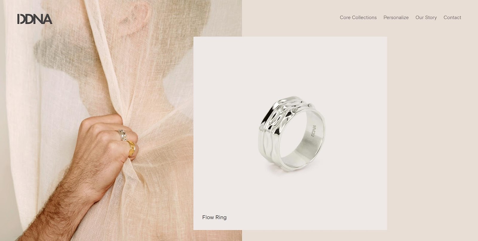
A strong example of this is DDNA, a jewelry brand focused on meaningful and personalized pieces.
Their site is minimal but not sterile. Each product is given room to stand out. Soft photography, clean lines, and balanced spacing make everything feel intentional. It’s not loud, but it’s effective. The design makes the jewelry feel exclusive, personal, and worth paying attention to.
Source: d-d-n-a.com
This thoughtful design doesn’t shout for attention but communicates quietly and purposefully. It adds perceived value to the product, making each piece feel more exclusive and meaningful.
White space might not grab attention like bold headlines or flashy visuals, but its impact runs deep. It shapes how people feel, what they notice, and how easily they connect with what you offer.
When used with intention, white space turns noise into clarity and hesitation into action.
If your design feels crowded or unclear, it’s probably not your content but the space around it. That should be your cue that it’s time to give your message the room it deserves.
Paste content here

 Send emails at scale