LIMITED SPOTS
All plans are 30% OFF for the first month! with the code WELCOME303
LIMITED SPOTS
All plans are 30% OFF for the first month! with the code WELCOME303

LIMITED SPOTS
All plans are 30% OFF for the first month! with the code WELCOME303
Most websites get the relationship between user experience and conversions wrong. They focus on making things look pretty or they obsess over conversion rates, but they treat these as separate problems.
That’s why you see gorgeous sites that nobody buys from, or ugly pages that convert well but feel terrible to use.
The truth is simpler than most people think. When you align UX with conversion optimization, you don’t have to choose between looking good and making money. You can have both.
We’ve spent years watching companies struggle with this balance. They’ll hire a UX team to make users happy, then bring in CRO specialists to boost sales. These teams often work against each other without realizing it. The UX team removes friction while the CRO team adds urgency. The result is often a confusing mess that serves nobody well.
Let’s fix that. Here’s how to build user journeys that feel natural and convert like crazy.
When prospects can touch and feel your product immediately, they stop wondering if it works and start imagining how they’ll use it. This shifts them from skeptical browsers to engaged users in seconds. For larger organizations looking to integrate AI into their workflows, using an enterprise AI prototyping platform can accelerate testing and deployment across teams. Platforms like this allow enterprises to quickly validate ideas, ensure alignment with business goals, and reduce the risk of failed implementations. By giving teams hands-on experience early, they move from concept to actionable prototype much faster.
The psychology here is straightforward. People trust what they experience over what they read. A demo video might show your product’s capabilities, but actually using it creates ownership. Once someone invests time in trying your tool, they’re more likely to stick around and eventually buy.
To get this to work:
Outline your product’s core value proposition. What’s the one thing that makes users go “wow”?
Build that into your homepage. Don’t hide it behind signup forms or lengthy explanations. Make it accessible with one click.
Keep the trial experience focused. Don’t overwhelm prospects with every feature you’ve built. Show them the main benefit, then guide them toward the next logical step.
Create clear pathways from trial to signup, but don’t be pushy about it.
Technical implementation matters too. Your trial feature needs to load fast and work flawlessly. A broken demo destroys trust faster than no demo at all.
Test it regularly across different devices and browsers.
An example of a brand that executes this perfectly is Bubble, a visual web app development platform. Their homepage features a text field where visitors describe an app idea using plain English.
Submit your prompt, and their AI generates a working prototype you can immediately explore and modify. You’re not reading about no-code development but actually doing it.
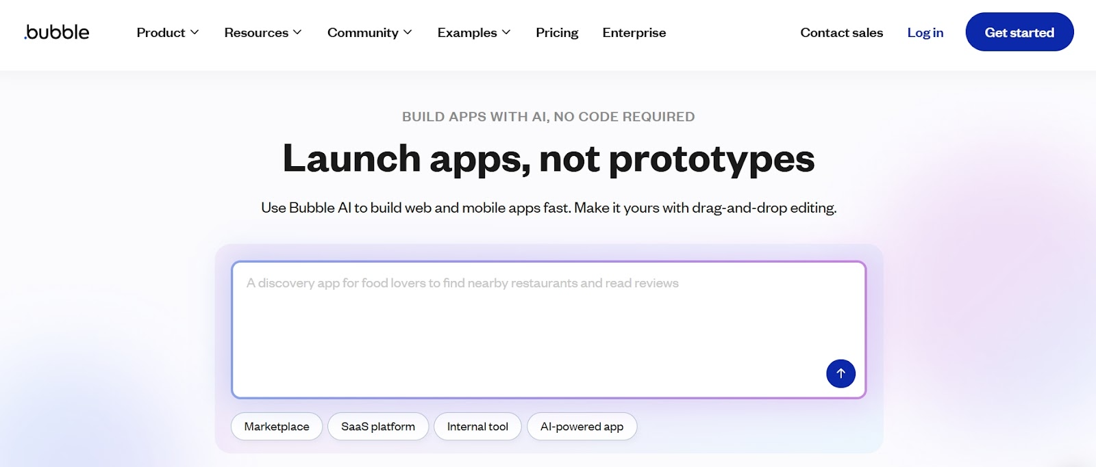
Source: bubble.io
This approach works because it eliminates the biggest friction point: uncertainty about whether the platform can handle your specific needs.
Instead of wondering if Bubble works for your project, you’re already building it. The transition from curious visitor to active trial user happens in under 30 seconds.
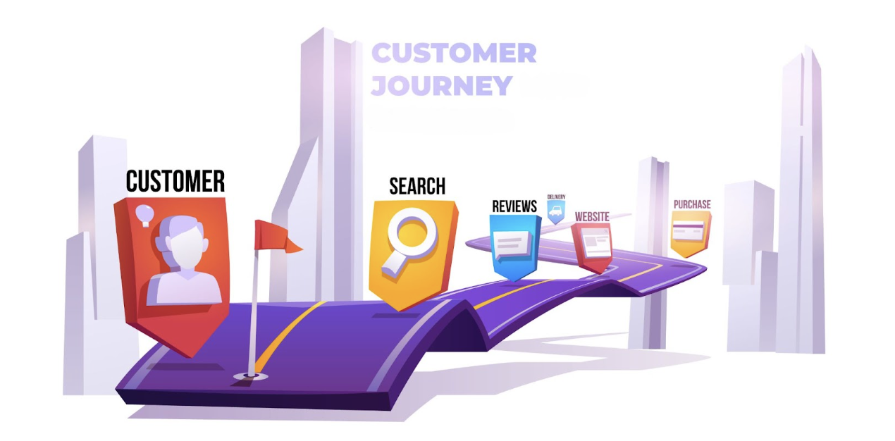
Complex services scare people away. When prospects can’t visualize how you’ll help them, they bounce to competitors who explain things better. Clear process breakdowns turn confusion into confidence.
People need to feel in control of their buying decisions. When you outline exactly what happens next, you remove the fear of the unknown. This transparency builds trust and reduces purchase anxiety, especially for high-consideration services.
To get this to work:
Map out your entire customer journey from initial contact to final delivery.
Identify the key milestones that matter most to your prospects. These aren’t your internal workflows but the steps customers actually care about.
Keep each step simple and action-oriented. Use plain language that a newcomer to your industry would understand. Avoid jargon, acronyms, or technical terms that might confuse people. Each step should answer the question “what happens next?”
Visual elements help tremendously. Icons, illustrations, or simple graphics make each step more memorable and easier to scan. But don’t let design overshadow clarity. Your copy should work perfectly even without visuals.
Test your process explanation with real prospects. If they ask follow-up questions about any step, that step needs clearer wording. The goal is to eliminate confusion before it starts.
Start in Wyoming, a business formation service provider, does this exceptionally well.
Their homepage breaks LLC formation into five straightforward steps, from choosing a business name to getting your official documents. Each step includes a brief description and a clean illustration that reinforces the action required.
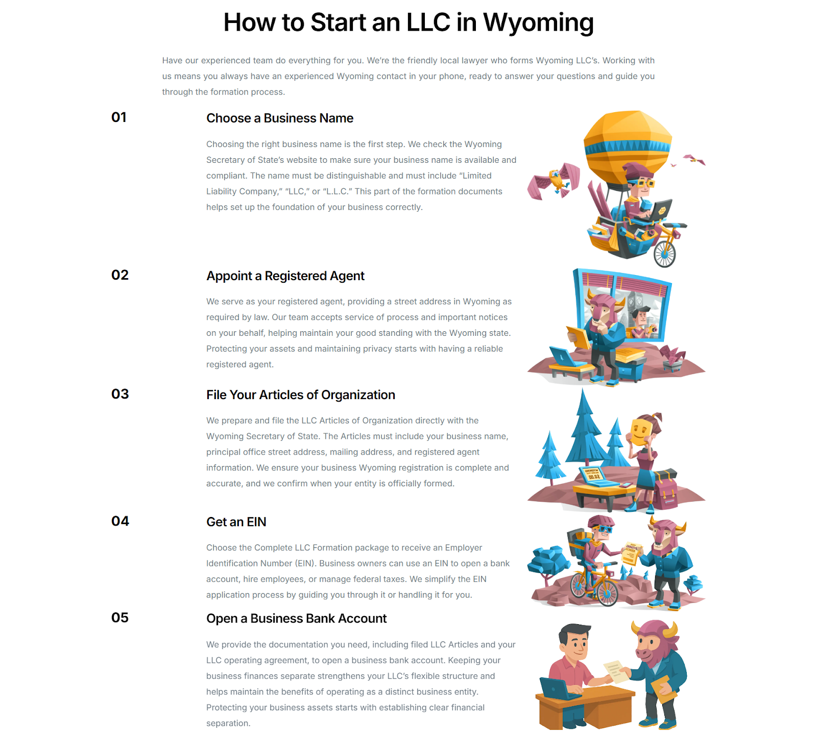
Source: startinwyoming.com
This method works because forming an LLC feels overwhelming to most entrepreneurs. By showing exactly what happens and in what order, Start in Wyoming transforms a scary legal process into a manageable checklist. Prospects stop worrying about the unknown and start focusing on their business goals.
Doubt kills conversions faster than bad design. When prospects reach moments where they need to decide whether to trust you, social proof provides the reassurance they’re looking for.
Research shows that 74% of consumers say positive reviews make them more likely to trust a business.
Social proof works because we’re wired to follow what others do, especially when we’re uncertain. When prospects see that similar people have succeeded with your product, it reduces their perceived risk and validates their decision to move forward.
To get this to work:
Place social proof strategically throughout your user journey, not just on a single testimonials page.
Add customer logos near your value proposition.
Include review snippets close to pricing information.
Feature case study highlights before contact forms.
Match your social proof to your audience’s concerns. B2B prospects want to see recognizable company names and detailed results. Consumers care more about star ratings and relatable experiences. Technical buyers need specific metrics and implementation details.
Keep testimonials specific and credible. Generic praise like “great service” doesn’t convince anyone.
Instead, look for quotes that mention concrete benefits, measurable results, or specific problems you solved. Include the person’s name, photo, and company when possible.
RapidDirect, a custom manufacturing service for precision parts, executes this strategy across multiple touchpoints.
Their homepage features logos from well-known industrial clients, displays verified ratings from an independent review platform, and showcases customer success stories that link to full case studies with measurable outcomes.
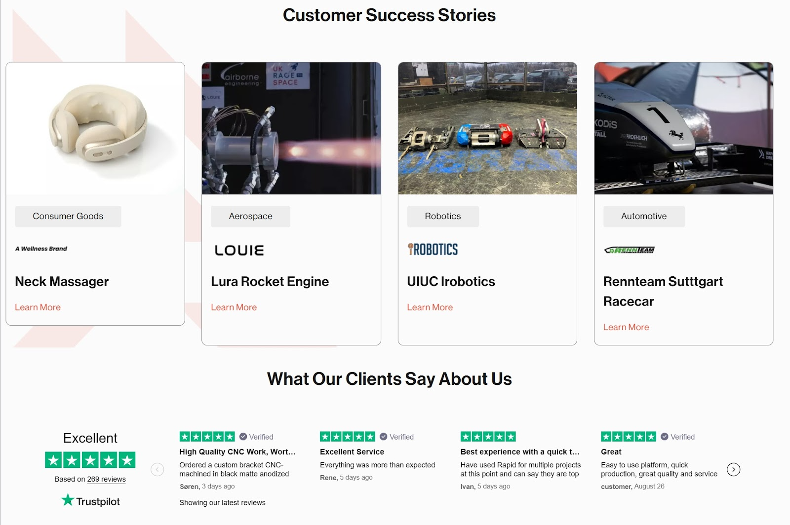
Source: rapiddirect.com
This layered approach is effective because manufacturing decisions involve significant risk and investment. Engineers and procurement managers need proof that you can deliver quality parts on time and within specifications.
By showing social proof at every stage, RapidDirect addresses these concerns before they become objections.
Generic CTAs blend into the background while strong ones pull prospects forward. The difference between “Submit” and “Start Your Free Trial” can make or break your conversion rates.
Action-oriented language in CTAs can boost conversions by 121% compared to passive alternatives. Furthermore, brands offering free trials see a 32% increase in customer acquisition, with conversion rates jumping 56%.
Effective CTAs work because they address two psychological barriers simultaneously: clarity and risk. People need to know exactly what happens when they click, and they need to feel safe doing it. When you remove uncertainty and lower stakes, prospects act faster.
To get this to work:
Use active, specific language that tells people exactly what they’ll get. Instead of “Learn More,” try “See Live Demo” or “Get Your Free Quote.”
Replace “Sign Up” with “Start Free Trial” or “Get Instant Access.” The more specific your promise, the more confident people feel clicking.
Design your CTAs to stand out visually. Use contrasting colors that pop against your background.
Make them large enough to see clearly on mobile devices. Surround them with white space so nothing competes for attention.
Add supporting copy that eliminates friction. Phrases like “No credit card required,” “Cancel anytime,” or “Setup in 2 minutes” address common hesitations before they arise.
Rosie, an AI-powered phone answering service for small businesses, demonstrates this approach perfectly. Their homepage features a prominent “Get Started for Free” button in their signature purple color. This immediately signals no upfront cost.
Additionally, supporting microcopy reading “Start risk-free: 25 free minutes included” reinforces the no-commitment promise and quantifies the value.
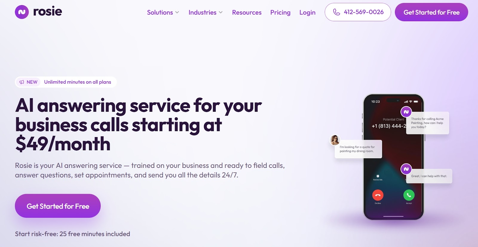
Source: heyrosie.com
This is a winning combination for services that feel like a significant commitment. By emphasizing the free trial and specific minutes included, Rosie transforms a high-stakes decision into a low-risk experiment.
Hidden pricing creates suspicion and wastes everyone’s time. When prospects have to hunt for costs or schedule calls to learn prices, most will leave for competitors who show their cards immediately.
Brands with clear pricing models report 94% customer loyalty because transparency builds trust from the first interaction.
Pricing transparency is an effective method because it qualifies prospects automatically. People who can’t afford your service leave quickly, while qualified buyers move forward with confidence. This saves your sales team time and improves conversion quality.
To get this to work:
Put pricing on your homepage or make it accessible with one click. Don’t bury it in submenus or behind contact forms. If your pricing varies significantly, show starting prices or typical ranges to set expectations.
Break down what’s included in each tier clearly. List specific features, limits, and benefits so prospects can easily compare options.
Use simple language that non-technical buyers can understand. Avoid vague terms like “advanced features” or “premium support.”
Address common pricing concerns directly. If you offer free trials, money-back guarantees, or flexible payment terms, highlight these prominently. If setup fees or additional costs apply, mention them upfront rather than surprising people later.
Use visual hierarchy to guide attention toward your recommended plan. Most companies see better results when they highlight their middle-tier option as the “most popular” choice.
Vidpros, a video editing service marketplace, exemplifies this approach by featuring their pricing structure directly on their homepage.
Their tables clearly outline what each service tier includes, from turnaround times to revision limits, with no hidden fees or surprise charges.
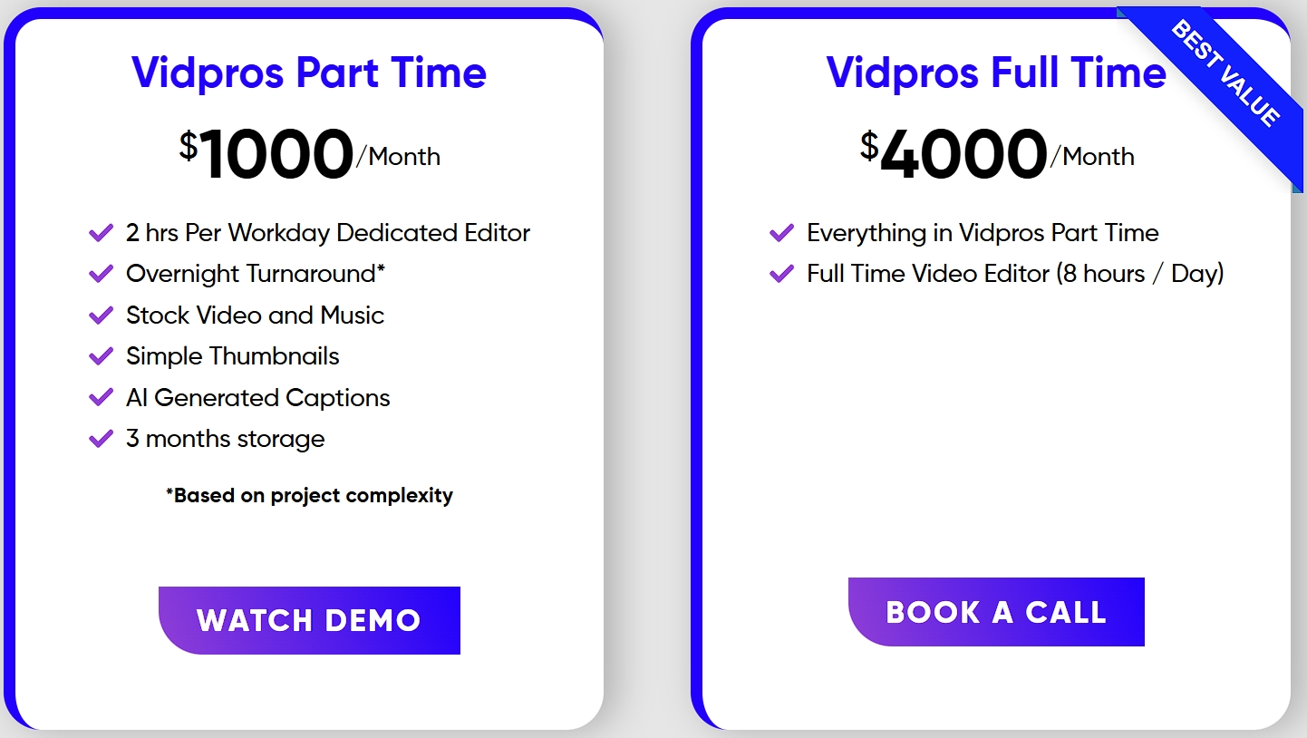
Source: vidpros.com
This upfront clarity helps prospects focus on the service itself rather than worrying about what might be concealed in the fine print.
By making their pricing transparent, Vidpros builds trust and helps visitors make decisions quickly.
Prospects arrive at your website with built-in skepticism. They’ve been burned by poor products, bad service, or misleading claims before.
Trust signals act as conversion insurance by addressing the specific doubts that make people hesitate before buying.
These signals also tackle anxiety at its source. When someone worries about product quality, seeing “Made in USA” or industry certifications provides instant reassurance. When they’re concerned about company stability, “Family Owned Since 1998” suggests longevity and personal accountability.
To get this to work:
Recognize the most common objections your prospects have. Do they worry about product quality, company reliability, or customer service?
Survey past customers or review support tickets to find recurring concerns. Your trust signals should directly counter these specific worries.
Place trust signals prominently where decision-making happens. Position them near your value proposition, above pricing information, or close to purchase buttons. Don’t hide them in footers where nobody looks.
Make each signal specific and verifiable. “Award-winning customer service” sounds generic. “24/7 support with 2-minute average response time” provides concrete reassurance. Include relevant details that matter to your audience.
Back up your claims with proof when possible. If you mention certifications, link to verification pages. If you claim awards, specify which ones and when you received them.
Nerdwax, an eyewear grip enhancement company, strategically positions four key trust signals directly below their main headline: “Made in the USA,” “Family Owned & Operated,” “We Love Sustainable Materials,” and “The Best Stuff.”
Each element includes supporting copy that explains why these qualities matter.
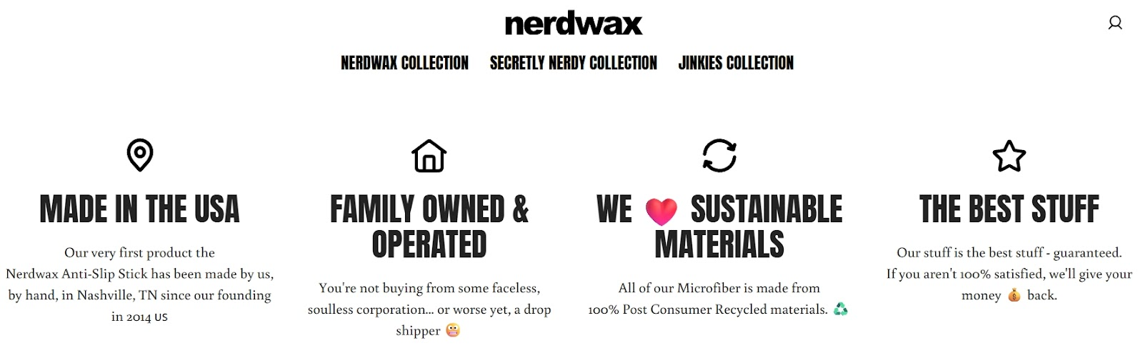
Source: nerdwax.com
This strategic placement tackles potential objections before they even form, assuring visitors they are making a smart, ethical, and high-quality purchase from a company they can trust.
Building high-converting user journeys doesn’t require choosing between user happiness and business results. When you remove friction, provide clarity, and address concerns upfront, you create experiences that feel natural to users and profitable for your business.
When UX and CRO work together, conversions stop being forced outcomes and start becoming the logical result of a well-designed path.
So, start with one tactic from this list, test it thoroughly, then build from there. That way, you’ll shape a journey that makes sense for your users and your business alike.
 Send emails at scale